Showing posts with label clients. Show all posts
Showing posts with label clients. Show all posts
Monday, July 22, 2013
Stump-endous
You've heard people say that a stump is a stump is a stump, right? No? Well, it doesn't matter because it's not true, especially if it's a super cute Heart Stump Wood Container by Shop Toast.
This is a (very) short story about how the adorable printed stump shown above came to be.
I designed wedding invitations for my recently married bride, Wendy (actually, she adopted the "newlywed" moniker only a couple of days ago!)
She loved the finished invitations! She was also equally in love with Shop Toast's wood containers and wanted to use them as her favors.
Light bulb moment ensued.
I communicated with the ever-accommodating Jeremy of Shop Toast about file format, artwork specs, what his favorite sushi places were, and we were good to go.
<< cue triumphant fanfare >>
Wendy was kind enough to gift me with a sample stump and I absolutely L-O-V-E it!
Easiest client/vendor/vendor collaboration I've ever had the pleasure of working on.
Congratulations Wendy and David!
Labels:
clients,
custom,
heart stump,
invitations,
shop toast,
wedding,
wood container
Thursday, July 11, 2013
That vintage island feel
Friday, June 21, 2013
Let It Snow!
 |
| Snowflake installation! (Photo by Derek Wong Photography) |
I'll be honest, this was a monstrous task that took a lot of helping hands to create, pack, deliver and install (stationers are not equipped to climb ladders and thankfully I left that up to the talented crew at Vignette). I was happy just to have completed the job on time but it wasn't until I saw photos of the snowflakes by candlelight, against the gorgeous draping, and hanging above Erin and Matt that I was really able to appreciate what we had created.
 |
| Exchanging vows... (Photo by Derek Wong Photography) |
Thursday, June 20, 2013
Monogram - Two Ways
 |
| Custom gobo (Photo by Derek Wong Photography) |
 |
| Monogrammed aisle runner (Photo by Derek Wong Photography) |
Wednesday, June 19, 2013
Naughty or Nice?
 |
| "Naughty" favor boxes (Photo by Derek Wong Photography) |
 |
| "Nice" favor boxes (Photo by Derek Wong Photography) |
They presented their guests with a choice of "Naughty" or "Nice" gourmet chocolates packaged in red and white pillow boxes. We designed corresponding tags and a framed sign that invited guests to make their selection at the end of the evening. Love bringing clients' creative ideas to life!
Tuesday, June 18, 2013
Holiday-Inspired Invitation...the nose knows
 |
| Holiday-inspired invitation (Photo by Derek Wong Photography) |
This invitation was for a winter wedding back in December. There were so many fun elements to this wedding, that I decided to cover them all in multiple posts. (When you've taken a break from writing as long as I have, you gotta ease back into a little at a time. I don't want to sprain a muscle or anything.)
So, back to the invitation shown above. My clients, Erin and Matt, wanted a festive piece that tied in with their Christmas themed extravaganza. (I refer to it as an "extravaganza" because, well, you'll see why after I'm done writing about it.) A color scheme of red and white and touches of silver worked seamlessly with the printed Christmas ornaments that festooned the invitation and response card. The outside of the invitation was wrapped with a red and white striped paper band and a little "no peeking 'til Christmas" sign...the "no" was crossed out, so technically it was a "NO no peeking 'til Christmas" sign which gets a little confusing when you think about it too long. So don't think about it too long.
The hidden gem of the invitation, though, was the scent. Yes, I said scent. Erin and Matt's uber creative wedding coordinator, Mona Hirata from Weddings by Grace and Mona, suggested that we add a holiday scent to the invitation to drum up even more excitement for their guests. Why not? I love trying new things and scent was definitely a new thing.
Erin and Matt's scent of choice was pine. Great! Little did I know that finding pine-scented anything in the month of August was near impossible. Sure, I could order something online but without the benefit of sniffing something firsthand (first nose?), online shopping was my last resort. I decided to hit up some local stores in search of essential oils. Bingo. The very first store I visited had pine...too bad it was too earthy. (It actually smelled like a rotting tree, but I think "earthy" sounds classier.) The second store I visited also had pine...well, they had an empty slot reserved for pine but they were sold out. Lots of other tree scents like sandalwood and eucalyptus were perched in their slots, but no pine.
Out of desperation, my husband and I took a spin by an auto parts store. Yes, the idea of shredding the hanging Christmas tree car fresheners sounded ridiculous, but how awesome would it be if that worked? IT DID NOT WORK. IT WAS NOT AWESOME. Lesson #1: Christmas trees that dangle from your rear view mirror do not smell anything like Christmas trees. Lesson #2: Don't tear open the package of Christmas tree air fresheners in a confined space (like your car) unless you're prepared to go rogue and toss it out of the window while driving down the highway (for the record, I didn't litter...but I did hang my arm out of the window the whole ride home).
Scarred from the whole pine fiasco, I suggested to my clients that we go with a peppermint scent. A nice, refreshing, easy-to-find peppermint scent. This was my first custom invitation that smelled as good as it looked.
Thursday, January 31, 2013
Congratulations Mr. and Mrs. Seabert!
I love it when my clients are quick to respond to emails. I love it when they are kind and unassuming. I love it when they appreciate the little details just as much as I do.
And I am over the moon when I have clients who encompass all those things and so much more. Meet Michele and Chris Seabert...newlyweds (aka awesome clients)!
Interesting fact...my "relationship" with Michele and Chris came down to this:
5 months + 1 in-person consultation + 107 email messages = 1 happy couple and 1 happy designer
Because of busy work schedules and challenging logistics, we relied heavily on email communication to get everything done quickly and efficiently: ideas exchanged, proposals sent and accepted, proofs reviewed and approved, delivery and pick-up times scheduled. 107 emails sounds like a lot, but it really wasn't considering how much we got accomplished. Michele and Chris ordered invitations, table number cards, favor tags, thank you cards...
For their "fall romance" wedding, I incorporated a spray of phalaenopsis orchids, an antique gold backing clear Swarovski crystal accents, and rich purple pocket fold.
 |
| Pocket fold invitation with phalaenopsis orchids |
The response and outer envelopes were a pale metallic gold.
 |
| Printed return address on back flap |
 |
| And a bonus photo of Michele's gorgeous bouquet...just because |
Thank you to Michele and Chris for allowing me to be a part of your special day!
Photo credit: T. Goda Media
Tuesday, January 17, 2012
My latest accessory
I love picking up new accessories, whether it be the fashion kind or the electronic kind. But my newest acquisition doesn't fall in either category yet it's the most meaningful to me as a business owner.
Each year, WeddingWire selects the top 5% of wedding professionals in its nationwide network based on client reviews. I'm so very honored that Emi Ink received this award. I'm committed to giving my clients the highest level of service simply because they deserve it. I've been blessed with the opportunity to work with some of the most amazing people and it is only because of my client base that I'm able to have a job that I love.
I'm proud to show off my newest accessory (see it over there in the right side bar?). It goes with everything, don't you think?
Wednesday, January 11, 2012
Real Life Wedding Showcase in Hawaii Bride & Groom Magazine!
Have you checked out the Fall/Winter 2011 issue of Hawaii Bride and Groom Magazine? I was thrilled to see my lovely couple - Genie and Arthur - featured in the Real Life Wedding Showcase!
I remember my first consultation with Genie quite well. She had seen a menu card that I designed for a photo shoot by Hawaii Bride and Groom Magazine earlier in the year. She was drawn to the beautiful textured paper and elegant colors of ivory and antique gold. That menu card served as the inspiration for Genie and Arthur's entire stationery suite.
There was a seamless transition throughout all of the stationery pieces. From the invitations and ceremony programs to the escort cards, place cards and menu cards, everything was designed to complement the vintage Hawaii theme.
My working relationship with them, had a surprise epilogue a few months ago. Genie and Arthur wanted a special way to commemorate their first anniversary and subsequent anniversaries. They had decided to write letters to each other and asked for my input in bringing their vision to fruition. We decided on an ivory scrapbook with personalized pages - one page for each of them to write on for the first ten years of their marriage.
 |
| Genie and Arthur |
There was a seamless transition throughout all of the stationery pieces. From the invitations and ceremony programs to the escort cards, place cards and menu cards, everything was designed to complement the vintage Hawaii theme.
My working relationship with them, had a surprise epilogue a few months ago. Genie and Arthur wanted a special way to commemorate their first anniversary and subsequent anniversaries. They had decided to write letters to each other and asked for my input in bringing their vision to fruition. We decided on an ivory scrapbook with personalized pages - one page for each of them to write on for the first ten years of their marriage.
Thank you Genie and Arthur for allowing me to be a part of your special day!
Photographer: Marcia Campbell Photography
Florist: Designs by Hemingway
Friday, November 11, 2011
In the last 18 days...
...I forgot to decorate my 5" pumpkin for Halloween. It's still sitting on my kitchen counter.
...I finally met with my bride from Australia who was delighted with her hot pink, orange and black stationery pieces: favor tags, stickers for take-home cake boxes, guest book, table cards.
...I moved my studio to a place with a better view and less roosters.
...I wondered, more than once, if I'm a closet hoarder of paper.
...I ignored my husband, more than once, as he accused me of being a blatant hoarder of paper.
...I finished menu cards, escort cards and reserved cards for a Rastafarian wedding today. Simple and modern black and white palette accented with small pops of red, yellow and green.
...I sold a couple of my gold jewelry pieces to The Diamond Specialists and was surprised at how much cash I got back! Am now going to search for more unwanted jewelry from unwanted ex-boyfriends that might still be lying around.
...I met one of my couples the day before their wedding to deliver toss petal cones, reserved seating signs, escort cards, table cards and drink tickets. I'm going to miss working with this sweet, sweet couple.
...I tried out Cafe Duck Butt with a group of friends for pupus and drinks. Lots of laughs (and lots of soju).
...I wished that I could channel Dr. Doolittle and speak to my sick dog. It's heartbreaking to care for a pet that's not well.
...I refused to believe that not only is it November, but Thanksgiving is in LESS THAN TWO WEEKS. Time to plan the menu. Time to break out the stretchy pants.
...I finalized plans for my holiday retail items! More info coming soon.
Off to wrap chocolates at Menehune Mac's seasonal store at Windward Mall today!
Thursday, October 20, 2011
Real wedding: Cheryl and Chuck
Oh, how I adore my clients. They sustain me, inspire me and motivate me to keep on doing what I love.
Exhibit A: Cheryl and Chuck
 |
| The happy couple at the Royal Hawaiian hotel |
 |
| Charcoal gray pocket fold invitation with multiple insert cards and wraparound address label |
 |
| I always LOVE this wedding ring shot! |
 |
| The finishing touch for the invitations was a tag that Cheryl tied to the outside of the pocket folds. |
 |
| A memorable wedding keepsake for sure! |
 |
| Happily ever after... |
Friday, May 20, 2011
I *heart* my clients
Recently, I've been thinking a lot about Emi Ink's early years. To some extent, I employed a "sink or swim" strategy during my first year...although, "sink" wasn't really an option for me. There was no question that I would accept any job that came my way, I never said "no" to my clients, and I would often grossly underestimate the amount of labor that my jobs would require. It was a learning process, painful at times, but so rewarding in the end.
One of my earliest invitation jobs was for May and Gregg, a sweet couple who probably had more confidence in my design skills than I had in myself at the time! I can't recall how many hours this job took me to complete, but it had EVERYTHING: rounded corners, hand embossing, die-cut flowers, a washi paper band, organza ribbon, vellum, a perforated response card, etc. I probably learned more about the design/assembly process in that one job than I did in the next 20 jobs that followed.
May and Gregg are nearing their fifth anniversary and although the odds of them reading this particular blog are slim, I'd like to thank them and every lovely couple I've worked with since then. My clients, past and present (and future!), fuel my passion for creativity and I'm eternally grateful for that!
Thursday, May 5, 2011
Help us help you
When I'm meeting with my clients for the first time, I can normally size them up pretty quickly and assign them to one of three categories after a few minutes of discussion:
1) I HAVE A CLEAR VISION, PLEASE EXECUTE IT FOR ME.
This client knows exactly what they want from distinct color, to style, to specific fonts. They've labored over all the details and may have even put together a mock-up of the design themselves. Little time is wasted in making decisions
1) I HAVE A CLEAR VISION, PLEASE EXECUTE IT FOR ME.
This client knows exactly what they want from distinct color, to style, to specific fonts. They've labored over all the details and may have even put together a mock-up of the design themselves. Little time is wasted in making decisions
2) I KNOW WHAT I LIKE AND DON'T LIKE, PLEASE HELP ME TRANSLATE THIS.
This client may come in with magazine tear sheets, fabric swatches, images of different invitation styles that they've collected off the internet. They have a general idea of the design direction they'd like to go in, but need guidance in how to pull it all together.
3) I HAVE MY COLORS PICKED OUT. THAT'S IT. PLEASE HELP ME...I'M BEGGING YOU
This client wants an overview of every option that's available. They're not sure if they want something simple or something elaborate. They appreciate a slow and steady approach in which they can see lots of samples in hopes that something will spark the perfect inspiration.
Honestly, I don't prefer one type of client over the other. I enjoy quick and efficient consultations with my "clear vision" clients just as much as I enjoy the challenge of helping couples discover their personal style preferences. It's all good. But what makes it even better is when my clients are open to suggestions and can benefit from my experience or knowledge. For example, maybe your dream invitation includes a beautiful satin bow wrapped around the outside sleeve but you don't realize that this will add bulk and require additional postage. Or maybe you're having a plated dinner and never thought to include menu options on your response cards.
You can't possibly be expected to know all the ins and outs of invitations, or anything wedding-related for that matter, but that's what you should rely on the professionals for. Allow them to guide you, offer their expertise, and you can reap the benefits from their years of experience and knowledge. Relieve the pressure to know all, do all, control all. Help us help you.
And in my own personal attempt to not do all and control all, I've decided to give my coffee maker more control in my daily life. For the first time, I set up the auto brew function and came downstairs this morning to the smell of freshly brewed coffee. I never trusted it to actually come through for me like this, but that's part of own silly control issues hard at work. Yeah, anyway...
Sunday, October 10, 2010
Just another (10.10.10) day
 |
Custom sign-in sheets with orange/yellow color theme and pineapple design motif |
It's a busy, busy weekend for a lot of my wedding industry friends! 10.10.10 has been looming on the horizon since, well, 09.09.09, and it happened to fall on the very same weekend as a popular wedding expo. For brides and grooms, selecting highly sought after dates like 10.10.10 takes a lot of tenacity and early planning since the demand for wedding vendors can be incredibly high.
As for next year's big dates? I'm already working with 9.10.11 and 11.11.11 couples who are well on their way to finalizing plans for their big days.
Wishing all of my 10.10.10 couples a lifetime of happiness!
Wednesday, May 5, 2010
Elegant in eggplant
The problem with simple color names is that they leave lots of room for interpretation. If you tell a wedding vendor that your color is purple they could very well envision anything from lavender to violet to amethyst. But describing your color as "eggplant" is much more helpful and will ensure that you don't end up with a "Barney" wedding.
I worked with a lovely bride recently whose beautiful decor consisted of a deep aubergine (i.e. eggplant) and gold. This is such an elegant color combination and one that I was thrilled to work with.
I designed place cards for each guest with a gold/ivory patterned cardstock, names printed in antique gold, and clear Swarovski crystal accents. Guests' entree selections were added to the bottom right corner of each card.

The coordinating table number cards were tentfolds and each number sparkled with three crystals each.
I worked with a lovely bride recently whose beautiful decor consisted of a deep aubergine (i.e. eggplant) and gold. This is such an elegant color combination and one that I was thrilled to work with.
I designed place cards for each guest with a gold/ivory patterned cardstock, names printed in antique gold, and clear Swarovski crystal accents. Guests' entree selections were added to the bottom right corner of each card.

The coordinating table number cards were tentfolds and each number sparkled with three crystals each.
Wednesday, September 2, 2009
Keeping busy at work

A couple of months ago, I met with a couple who turned to the stars for their wedding inspiration. Not the stars up in the heavens, but the stars sitting on the bride's desk at work.
Over the years, the bride-to-be has folded hundreds of puffy paper stars during her spare time and collected them in a large vase on her desk. Everything from the wedding decor to her invitations are inspired by these pretty, iridescent stars. When the bride showed me the photo above, I couldn't help but notice the paper flowers that she fashioned out of POST-IT NOTES! Talk about creativity in the workplace!
Friday, June 5, 2009
Carisse + Todd
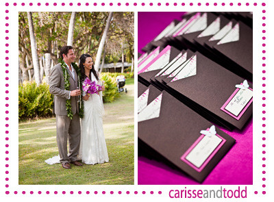
I adore my clients. I really do. And it's such a great feeling when my clients are inspired by my design aesthetic and see all the possibilities of using wedding stationery as an important element of decor. My clients, Carisse and Todd, are a great example of the perfect marriage that takes place between client + designer when a clear, shared vision becomes reality.
I started working with Carisse back in May 2008 after she spotted my work at the Wedding Expo. What transpired after that brief meeting was a wonderful collaboration of ideas and designs that resulted in a laundry list of custom stationery pieces. For this destination wedding couple, I created:
Luggage tag inserts
Save the dates
Engagement party invitations
Wedding invitations
Bridal shower thank you cards
Itineraries for welcome baskets
Itineraries for welcome baskets
Flip-flop tags
Table number cards
Escort cards
Programs
Menu cards
Table number cards
Escort cards
Programs
Menu cards
Reserved seating cards
Restroom signs
Restroom basket signs
At-home reception invitations
And I'm wrapping up this lovely paper journey with a scrapbook that the couple will be displaying at their at-home receptions in a couple of weeks. I haven't had a chance to photograph all the pieces that I created for them yet, so thank goodness for the gorgeous photos by Chrissy Lambert Photography! Check out some of the photos at styleschool (the cool wedding blog by InStyle Weddings) and on the cakelava blog (check out their insane cake here).
Tuesday, March 10, 2009
How could I say no?
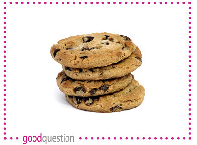
Two days ago I announced the GROOM'S QUOTE OF THE WEEK...last night a lovely bride took the prize for QUESTION OF THE WEEK.
After a quick meeting to finalize the details for their invitation order, I wrapped up by asking the bride and groom if they had any questions. A few seconds of silence passed and then, "DO YOU WANT A COOKIE?" The bride whipped out a bag of homemade chocolate chip cookies that I simply could not refuse.
I always tell my clients that there are no silly questions. And, in my book, any question involving a baked good is something to be taken very seriously.
Best question ever.
Sunday, March 8, 2009
When in the course of human events...
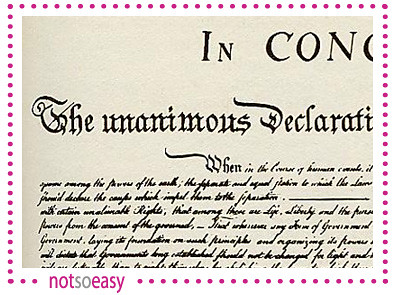
I had a fun meeting today. The bride and groom were warm and gracious, anxious to incorporate personal touches into their wedding stationery, and open to ideas and suggestions. But what I enjoyed most about the meeting was something the groom said. As we looked at font options together, the groom...let's call him "Jordan"...said that he didn't care for fonts that were hard to read. Like on the Declaration of Independence.
You gotta love comments that are random yet succinct...and inspire bursts of laughter.
Thanks, Jordan, for what I consider the GROOM'S QUOTE OF THE WEEK.
You gotta love comments that are random yet succinct...and inspire bursts of laughter.
Thanks, Jordan, for what I consider the GROOM'S QUOTE OF THE WEEK.
Wednesday, February 11, 2009
Rosalyn + Zevi: PART TWO
I am my beloved's and my beloved is mine.
This is one of the first things that Rosalyn and I discussed when we had our first consultation. We talked about an invitation that would represent Rosalyn's and Zevi's cultures while still maintaining an elegant and classic feel. It had to symbolize each distinct culture and also blend them together with one cohesive design. Not an impossible task, but definitely a challenging one.
We came up with a deep red double xi (double happiness) symbol encircled by the saying, "I am my beloved's and my beloved is mine" in both Hebrew and English. The interior of the invitation featured a watermark bamboo design behind the text to give it a softer feel.
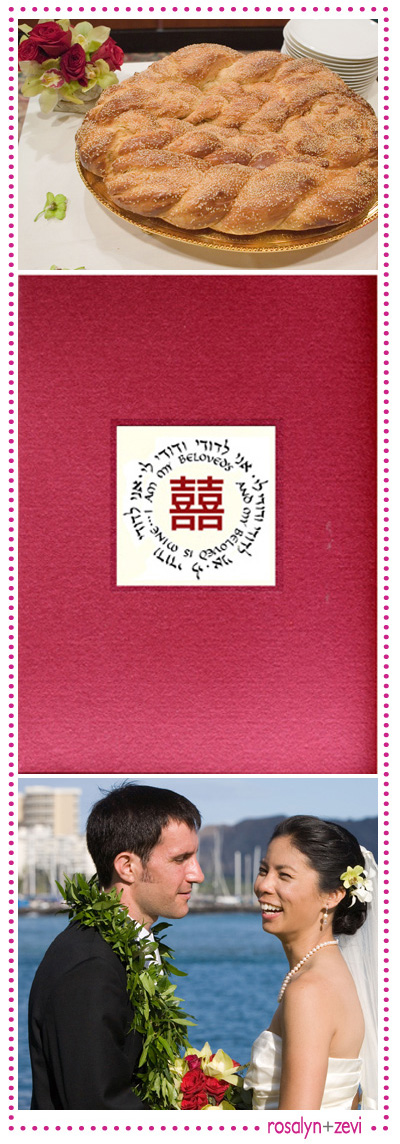
(The photo at the top is the challah that Rosalyn and Zevi ordered from a small local Jewish deli. They "broke bread" before starting the nine course Chinese dinner.)
Thanks to Rosalyn and Zevi for sharing these beautiful photos - and memories - from their wedding. It's so amazing to hear about all the ways they personalized this very special day!
This is one of the first things that Rosalyn and I discussed when we had our first consultation. We talked about an invitation that would represent Rosalyn's and Zevi's cultures while still maintaining an elegant and classic feel. It had to symbolize each distinct culture and also blend them together with one cohesive design. Not an impossible task, but definitely a challenging one.
We came up with a deep red double xi (double happiness) symbol encircled by the saying, "I am my beloved's and my beloved is mine" in both Hebrew and English. The interior of the invitation featured a watermark bamboo design behind the text to give it a softer feel.

(The photo at the top is the challah that Rosalyn and Zevi ordered from a small local Jewish deli. They "broke bread" before starting the nine course Chinese dinner.)
Thanks to Rosalyn and Zevi for sharing these beautiful photos - and memories - from their wedding. It's so amazing to hear about all the ways they personalized this very special day!
Subscribe to:
Posts (Atom)


