Showing posts with label wedding stationery. Show all posts

Thursday, July 25, 2013

Orange You Glad I Like Corny Titles?

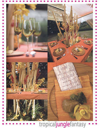
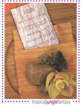
This is a stationery set that I designed for a fun couple last year. Cymbidium orchids and a vibrant color scheme of Tiffany blue and tangerine meshed seamlessly to create an island feel for this destination wedding! The 2012 Pantone Color of the Year was, in fact, Tangerine Tango...so this stationery suite was not only fitting of the locale but most definitely in vogue.

The thing is, although we are well into 2013 (and Emerald Green should be reigning supreme this year), bright, vivid oranges and soft coral tones are still holding strong. Perhaps it's because the islands are full of natural beauty and vibrant colors, perhaps it's because orange, when used alone or paired with another color, screams FUN.

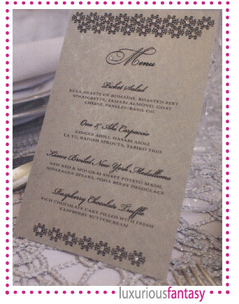
These are reception programs that I just produced for a wedding last weekend:

Truth be told, the inspiration behind the orange in this wedding was not the island's tropical flowers, but by the Chicago Bears team colors. With rich navy blue linen on their guest tables, the reception programs in their sweet little pockets provided a nice pop of color at each place setting.

And a bonus pic from one of their enclosure cards that was mailed with their invitations - we created a somewhat chic looking pattern from the Chicago Bears' logo:


Tuesday, October 5, 2010

Sweet sakura

Just finished up an order of favor tags for Menehune Mac. Their clients ordered square tags in pearlescent white and gunmetal gray with blush pink cherry blossoms. Thought it would be interesting to take a couple of "before and after" shots...as in, before bling and after bling. Swarovski crystals aren't everyone's cup of tea, but it's always amazing to see what a difference these little sparkly guys can make.

Tuesday, September 14, 2010

Tears of joy

I've been looking into redesigning my online gallery and while I decide on the final format, I've been digging up some of my favorite past jobs.

This program, designed for a chic black and white affair, was a memorable one. The bride was looking for a classic style, nothing over-the-top, nothing too glitzy. I used a heavy matte white card stock and paired that with a double face satin ribbon. The interior pages were printed on a crisp white linen paper.


At the bride's request, I added an interior pocket to the back cover with the printed message, "Tears of Joy." Naturally, this was the perfect spot to slip in a single tissue for her guests. Adorable.

Tuesday, February 2, 2010

Hello February


Hello "love" month! What treats do you have in store for us?

Am excited about this short and sweet month. The holiday madness is just a faint memory now, I've finally settled comfortably into 2010, and travel plans for the next eleven months are just starting to percolate. No time to waste, this is the time for focus.

Just wanted to share a few photos from last month's Bridal Expo. Naomi Lee from Les Saisons designed three gorgeous tables in the exhibition hall and graciously asked me to provide a few stationery pieces to complement her designs.

Pearl metallic program in champagne pocket, accented with ivory satin ribbon trim and Swarovski crystal embellishment:

Menu card mounted on antique gold mat, accented with gold Swarovski crystals:

Matte ecru place card mounted on dark walnut embossed wood grain card stock:

Thursday, July 16, 2009

Map maker, map maker, make me a map...


Today is one of those days that's filled with many, many little projects for me. Some are bigger in scope than others, but all together they comprise a very random workday that truly tests my ability as a multi-tasker.

One of the first things on my "to do" list was creating a custom map for one my clients. The act of drawing lines and shapes in itself isn't too difficult, but the whole idea that some guests may be relying on this one map to get to your once-in-a-lifetime wedding makes me take the art of map-making very seriously. Take Google maps for example. When I need to drive to a neighborhood I've never been to, I love that I can map it out on Google. What I don't love is the sometimes illogical routes that the Google gods suggest I take. No way around that, I guess.

Anyway, thought I'd share some tips about making maps for your wedding (whether you're doing it yourself or having a professional design it for you):

1) Get the address correct. Yeah, sometimes I receive wrong addresses with transposed numbers, or misspelled street names. Check it once, twice, three times.

2) Figure out where most of your guests will be coming from - east, west? It makes a difference in the directions you'll want to include.

3) Do your guests a favor and make sure that the directions you include are clear and concise...and accurate. If you're mapping it out on Google/Yahoo/Mapquest, check if this route is logical and avoids any known problem spots. Generally, if your venue can provide you with their standard issue directions, these are the best and most reliable.

4) Include major streets and important landmarks. No need to include every single little street on your map unless you have lots of empty space you want to fill up. Choose the important ones and any landmarks that will make it easier for your guests to find you.

5) Make it easy to read, please. You know that pretty, script that you used to spell out your names on the invitation? It has no place on your map card....seriously. Okay, maybe you can use it for major headings or the name of your venue, but don't use it for the tiny bullet-point directions or to identify street names. Please.

6) North, south, east, west. Mauka, makai, Ewa, Diamond Head. Determine if your map will benefit from a directional icon. Most of the maps I create are for Hawaii venues and I have the added benefit of being able to add in a lovely coastline for 99% of those maps. Lucky we live Hawaii.

7) Sometimes the little stuff goes a long way. Think of anything else that would be extra helpful to your guests. Do you want to designate a driving route with arrows? Indicate one-way streets that could be problematic? Provide mile markers or approximate driving times?

8) Just information or a pretty design? A map's sole purpose is to provide information, but that doesn't mean it can't be pretty, too. It's a part of your invitation set and I'm strong believer that it shouldn't stick out like a sore thumb. Can you carry over design elements from your invitation to your map card? Absolutely. Print it out on nice cardstock? Of course. You don't need to go overboard with your map, but it can be a wonderful addition in creating a cohesive look for your invitations.

Wednesday, July 15, 2009

Lovebirds


Delivered another batch of blank greeting cards to The Wedding Cafe over the weekend and included a half-dozen of the "Lovebirds" design shown above. I this sweet feathery duo and thought others might, too. There's been a recent love affair with bird design motifs in everything from stationery to housewares to jewelry...I love that a classic theme has made a comeback in a BIG way!

Thursday, June 11, 2009

Sweeeeet!


The wedding of my "cupcake clients" hasn't even happened yet and I'm already anxious to see their photos! Over the past couple of weeks, I've been immersed in all things SWEEEEET in prepping all the custom stationery for the reception. The sweetfest kicked off with recipe card invitations (photo coming soon!) and wedding guests will be rewarded with a celebration fit for Willy Wonka himself.

One of my favorite projects is shown above - a hanging sign with blinged out letters and giant cupcakes. Everything was trimmed by hand - sprinkles and all! Loved seeing the bride's reaction when she saw it for the first time.

Hope to have great photos to share from this delectable wedding!

Friday, June 5, 2009

Carisse + Todd


I adore my clients. I really do. And it's such a great feeling when my clients are inspired by my design aesthetic and see all the possibilities of using wedding stationery as an important element of decor. My clients, Carisse and Todd, are a great example of the perfect marriage that takes place between client + designer when a clear, shared vision becomes reality.

I started working with Carisse back in May 2008 after she spotted my work at the Wedding Expo. What transpired after that brief meeting was a wonderful collaboration of ideas and designs that resulted in a laundry list of custom stationery pieces. For this destination wedding couple, I created:

Luggage tag inserts
Save the dates
Engagement party invitations
Wedding invitations
Bridal shower thank you cards
Itineraries for welcome baskets
Flip-flop tags
Table number cards
Escort cards
Programs
Menu cards
Reserved seating cards
Restroom signs
Restroom basket signs
At-home reception invitations

And I'm wrapping up this lovely paper journey with a scrapbook that the couple will be displaying at their at-home receptions in a couple of weeks. I haven't had a chance to photograph all the pieces that I created for them yet, so thank goodness for the gorgeous photos by Chrissy Lambert Photography! Check out some of the photos at styleschool (the cool wedding blog by InStyle Weddings) and on the cakelava blog (check out their insane cake here).

Wednesday, February 4, 2009

Love potion

Sorry for the lag in blogging. Wish it was because my husband whisked me away for a surprise getaway, but it was because my schedule just got incredibly busy...so busy, that I've been responding to emails in the wee hours of the night, skipping lunch, and neglecting my ever-growing pile of laundry.

To make up for my sparse entries, I have the CUTEST thing to share with you today! One of my clients emailed this image to me...the very same image that was used on her save the date card:


The bride is a science teacher and one of her students was inspired to create this adorable illustration in honor of her upcoming nuptials. See the love potion that the teacher is holding? It doesn't get any cuter than that!

FYI, I have lots of photos to share from this client's wedding. It was filled with unique personal touches that celebrated the cultures of the bride and groom...seamlessly. As soon as I get my head on straight, I'll post the pics for you all to enjoy!

Thursday, December 18, 2008

Golden rings


On the 5th day of Christmas, my true love gave to me - 165 golden rings.

Naomi Lee from Les Saisons was kind enough to send me this photo of a client's pretty gold napkins with the gold, floral-embossed paper napkin rings that I made over the weekend. The imported paper was also used as a wraparound belly band on the couple's invitations...I will be updating my client gallery soon with more photos!

So, it's been another busy week and I'm counting down the days until I can take some time off for our annual trip. I'm trying to ignore the fact that, once again, I will most certainly be ill-prepared for a chilly Midwest visit. Instead, I keep repeating this to myself, "Fireplaces, hot chocolate, wool socks...oh my!" For now, though, I really need to keep my focus on the tasks at hand.

Over the past month, I was hit with a flurry of rush jobs. I'm about 70% done with the work that's due before Christmas, but as soon as we fly back home in January, I know I'll need to hit the ground running. It will be an interesting couple of weeks, that's for sure!

Thursday, November 13, 2008

Sweet Fantasy

Ahh, the sweetest table of them all...

Seeing this decor brought an instant smile to my face. The vibrant colors, lovely floral combinations and unexpected embellishments (like Rainier cherries!) were perfect for the Sweet Fantasy table.

For this table decor, I created a table name card with a playful striped backdrop, accented with soft pink Swarovski crystals and secured with a duo-tone paper pinwheel clip.


Be sure to pick up the current issue of Hawaii Bride & Groom to see the complete table decor that I've shared with you this week. The designers behind these fantasies are truly inspiring!

Table design: Sandra Williams of Finishing Touch
Floral design: Michelle Maeda of Flower Girls
Linen underlay and napkins: Les Saisons
Tableware, chairs and stools: Pier 1 Imports
Table name card design: Emi Ink
Location: Anela Garden

Wednesday, November 12, 2008

Vintage Fantasy

I love the vintage look of this table. Gold, red, ivory...everything about this tablescape is elegant and classic.


For the menu cards, I printed the text on an irridescent champagne cardstock and used an imported gold embossed matte with an intricate floral pattern. This was probably my favorite design that I came up with for the fantasy themed tables.


Tomorrow, I'll wrap up Hawaii Bride & Groom's Fantasy Tables feature with the most playful tables of them all, the Sweet Fantasy!

Table design: Su-V Expressions & REA Events and Designs
Floral design: Sueveangela Yamaguchi of Su-V Expressions
Linen & Canopy: REA Events and Designs
Menu design: Emi Ink
Location: Anela Garden

Tuesday, November 11, 2008

Luxurious Fantasy

The Luxurious Fantasy table featured in Hawaii Bride & Groom was all about crystal accents, platinum and silver hues, and gorgeous Phalaeonopsis orchids and Polo and Andian crystal roses. You can check out the full table decor when you pick up a copy of the magazine, but here are the detail shots:


The menu that I designed for this theme was covered in Swarovski crystals and printed on an imported brushed silver cardstock that shimmered from every angle.


Tomorrow we'll look at the Vintage Fantasy table!

Table and Floral design + Linens, Napkins and Tableware: Debbie Hemingway of Designs by Hemingway
Menu design: Emi Ink
Location: Anela Garden

Monday, November 10, 2008

Tropical Jungle Fantasy

The Fall/Winter 2008 issue of Hawaii Bride & Groom just hit the newsstands and I've been looking forward to sharing a couple of features with you. The first is a section called "Fantasy Tables" with lots of beautiful, dramatic, and awe-inspiring tablescapes to inspire you.

The Tropical Jungle Fantasy:


For this tabletop design, Emi Ink created the menu cards shown below. Designed with a wood-carved effect, I etched the words by hand for each of the menus...luckily, I only needed to do four menu cards!


Tomorrow, I'll share the Luxurious Fantasy table with you!

Table and Floral design + Canopy, Chairs and Linen: Yvonne Chapman of Yvonne Design
Stemware and Flatware: Pier 1 Imports

Menu design: Emi Ink
Location: Kualoa Ranch Mol'i Garden